AppIcon Studio
Design the icon once. Ship every size.
An icon is not one image, it is about forty files with names your project already expects. AppIcon Studio is the workspace where you draw the thing at 1024x1024, find out what it looks like at 16 px, and hand your project the folders it wants.
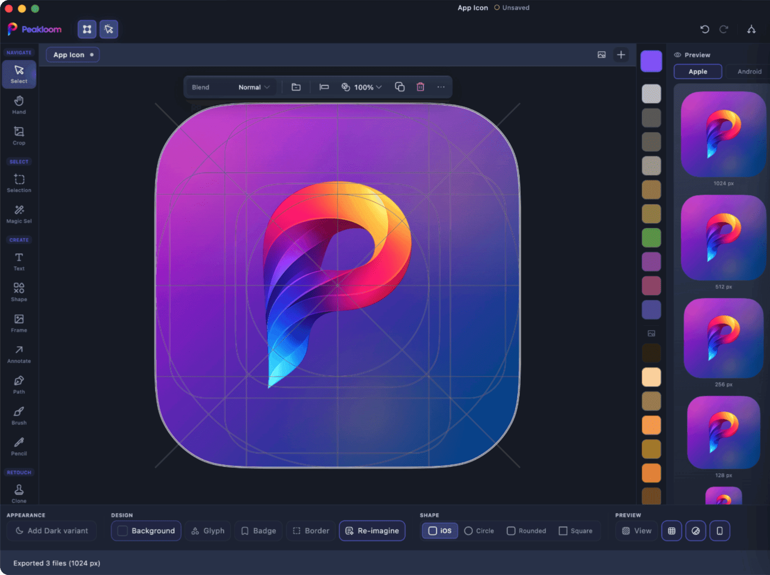
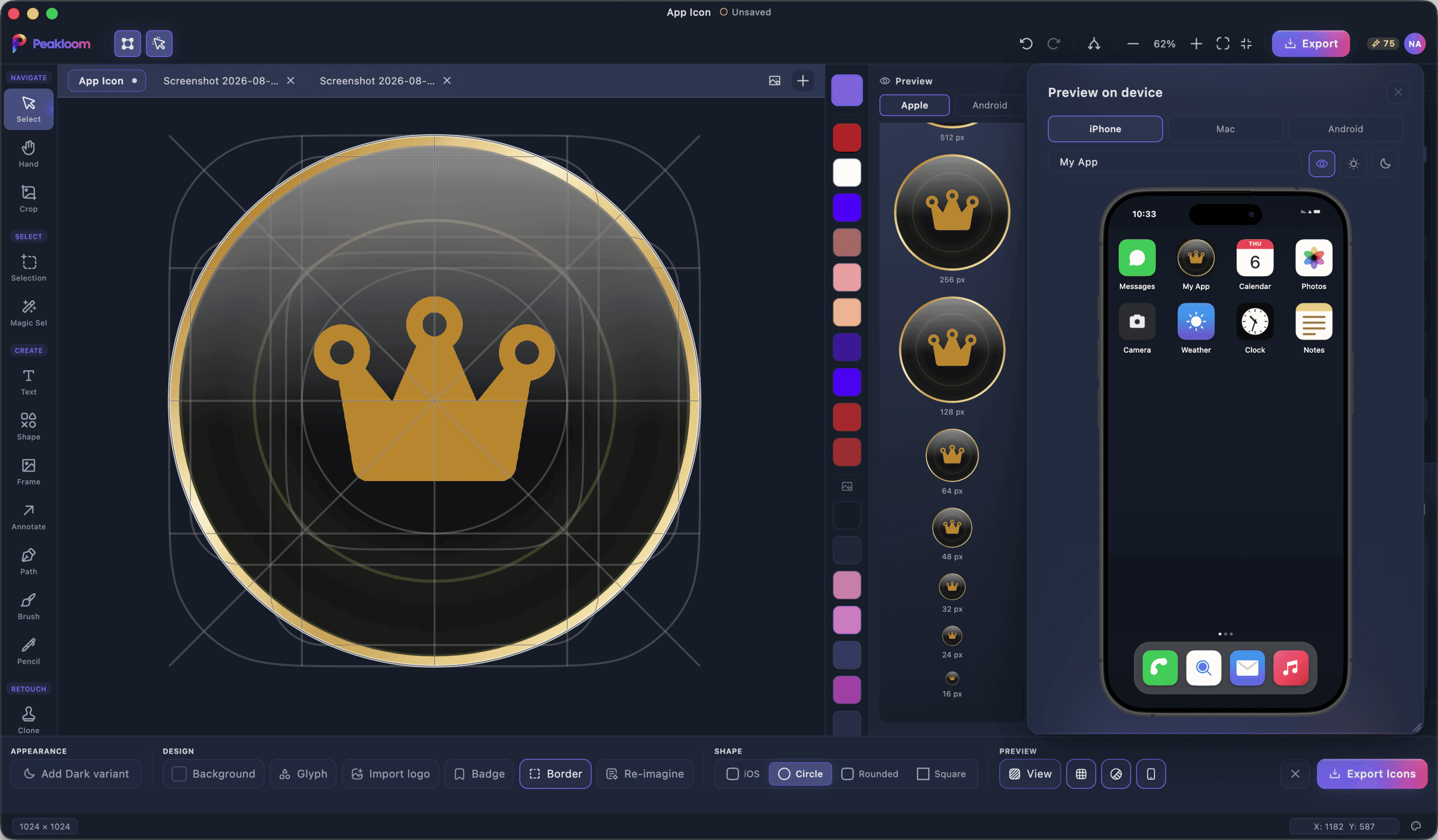
The size that decides everything is 16 px.
The preview column draws 16, 24, 32, 48, 64 and 128 px at their true pixel size - not thumbnails scaled to look neat. That is the whole point: a glyph that turns to mush in the menu bar looks fine at 1024, and you want to know now. The larger tiles scale to fit, and any tile can be exported on its own.
- Liquid
- Emboss
- Metal
- Mesh
- Gradient
- Duotone
- Glass
- Depth
- Night
- Pastel
- Mono
- Flat
- Bold
- Framed
- Outline
Type a feel, or just take the batch. The families are fixed; the colours are yours.
Twelve directions, before you commit to one.
Re-imagine redraws your icon as a batch of twelve looks pulled from fifteen style families - liquid, emboss, metal, mesh, glass, mono and the rest - all built from your own artwork's colours, on your machine, for free. Want a direction instead of a lottery? Describe the feel in a sentence and the AI art director answers with three concepts, then More looks explores inside those ideas at no further cost.
Light and dark variants ship inside the same export.
Every mask, and a dark variant.
Switch the canvas between the iOS squircle, a circle, a rounded square and a plain square to see the artwork inside the shape each platform will actually draw. Add a dark variant and it travels with the export instead of becoming a second file you maintain by hand.
- ios/
- AppIcon.appiconset/
- macos/
- AppIcon.appiconset/
- AppIcon.icns
- android/
- mipmap-*/
- ic_launcher-playstore.png
- web/
- favicon.ico
- site.webmanifest
- README.txt
The layout of a single export, README included.
Folders your project already expects.
One export writes the iOS and macOS appiconsets, an .icns with Apple's grid baked in, the Android density folders including adaptive and themed icons, the Play Store's opaque 512x512, and the web favicons with a site.webmanifest. A README.txt at the root says which folder goes where, so the handoff is a copy, not a puzzle.
Questions about AppIcon Studio
Which platforms does one export cover?
iOS, macOS, Android and web, in one pass. You get AppIcon.appiconset folders for iOS and macOS, an AppIcon.icns, the Android mipmap density folders with adaptive and themed icons plus the 512x512 Play Store image, and favicons with a site.webmanifest for the web.
How much of Re-imagine is AI?
Only the direction. The twelve looks are drawn on your machine by the local style engine from your icon's own colours, free and offline. If you describe a feel, that request and your icon go to Peakloom's servers, where a vision model picks which style families and palette fit - it returns a direction, never pixels, and your machine still does the drawing. Directing costs one credit; the More looks that follow are free.
Does it handle the Android safe zone?
Yes. Adaptive icons get cropped by whatever shape the launcher feels like using, so the canvas shows the safe zone and the export fits your artwork inside it. Themed (monochrome) icons are written too - they need compileSdk 33 or newer in your project.
Do I have to design the icon in Peakloom?
No. Bring a finished design in as an image, or open a .peakloom file and keep editing it. The canvas is a normal Peakloom document with layers, so the badge and border you add here stay editable rather than being burned into a flattened file.
Does it need an internet connection?
Only if you ask the art director for a direction. Drawing the icon, the twelve Re-imagine looks, the previews at every size and the export folders all happen on your own machine, offline. Nothing about the export ever leaves your computer.